The weekly motif : The Anatomy of an Icon, Why a Baboon is Coding the Future of Farming
🎨 THE WEEKLY MOTIF: Issue #1 of April 2026
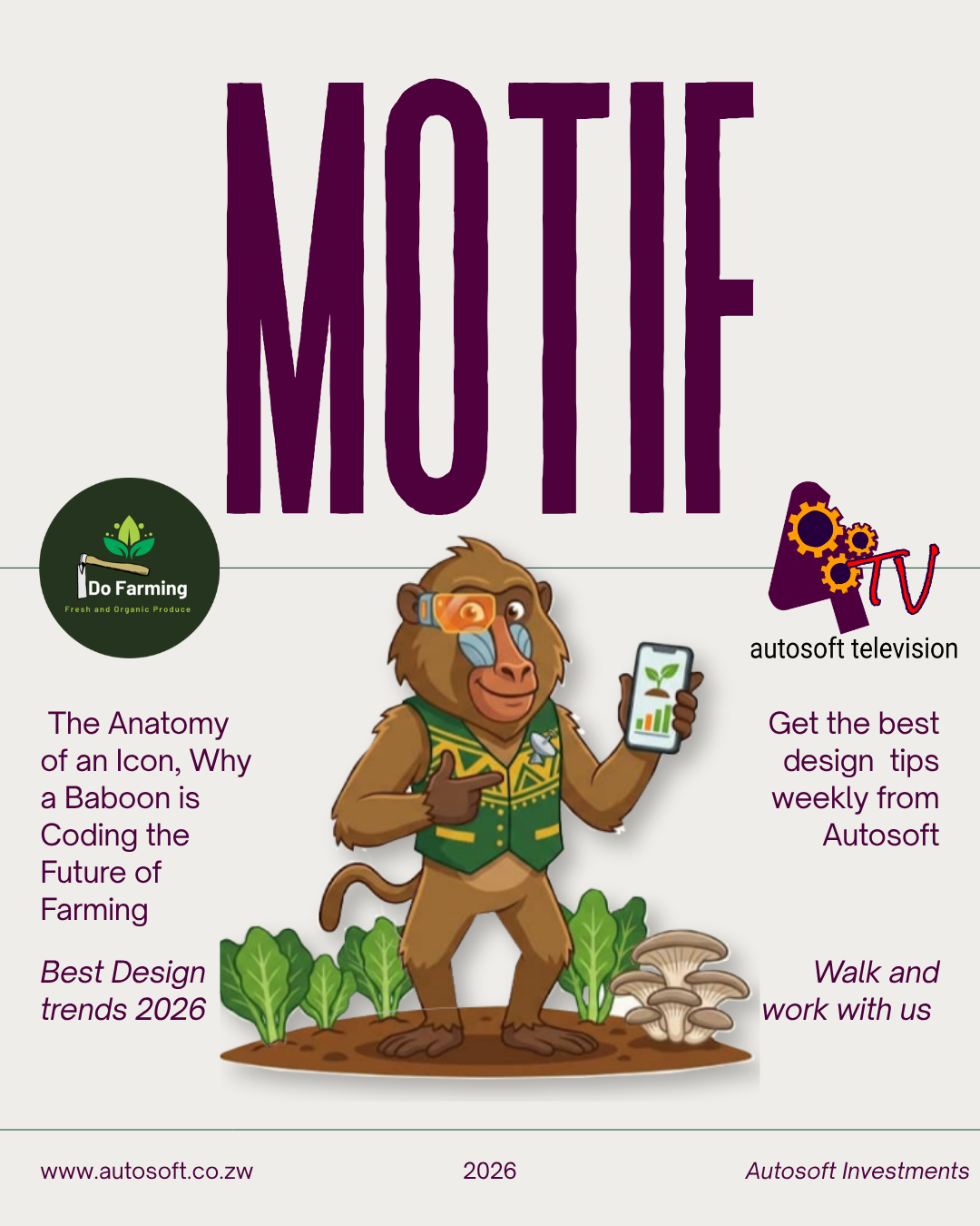
The Anatomy of an Icon: Why a Baboon is Coding the Future of Farming
In the world of global branding, characters aren’t just mascots; they are behavioral anchors.
Think of the Duolingo Owl. He isn’t just a bird; he is a persistent, slightly pushy coach that forces you to remember your Spanish verbs. When we sat down at Autosoft to design the face of our new agricultural division, Agri-Lingo, we didn’t want a generic "farmer" icon. We wanted a disruptor.
Enter Gudo the Wise.
1. The Psychology of the "Subverted Stereotype"
In Zimbabwe, the baboon (Gudo) is often seen as the ultimate farm antagonist—the clever raider who steals the harvest. By turning Gudo into the Guardian of the Harvest, we are using "Brand Jujitsu." We’ve taken an animal known for its intelligence and local presence and equipped him with a high-tech AI visor.
The Message: If the cleverest "raider" is now on your side, your farm is invincible.
2. Visual Language: Tech meets Texture
For Gudo’s design, we moved away from overly complex 3D renders. We chose Clean Vector Flat-Art (designed in Inkscape) for three reasons:
Scalability: It looks just as sharp on a billboard as it does on a tiny WhatsApp profile picture.
Trust: Flat, bold colors (Forest Green and Maize Yellow) feel professional yet accessible.
Animation Readiness: By using segmented vector layers, we can bring Gudo to life in short, low-data bursts—crucial for the Zimbabwean digital landscape.
Flat, bold colors ...... feel professional yet accessible.
3. The "Visor" Motif
The glowing orange visor isn’t just "cool." It represents Data-Overlay. It tells the farmer that while they see a leaf, Gudo sees the Nitrogen levels, the pest risks, and the harvest date.
The Takeaway: Good branding isn’t about being pretty; it’s about being functional. Gudo is the bridge between the laptop and the soil.
Designed by Autosoft. Transforming brands, one pixel at a time. 👉