The Power of Repetition: Designing a Unified Brand Motif Across Every Digital Touchpoint
In the rush to launch new platforms, features, and apps, it’s easy for a brand’s visual identity to become fractured. The website might use one set of buttons, the mobile app another, and the internal software yet a third. The result is often confusion, a loss of trust, and a dilution of the brand experience.
The solution is simple in concept, though complex in execution: establishing a clear, powerful motif.
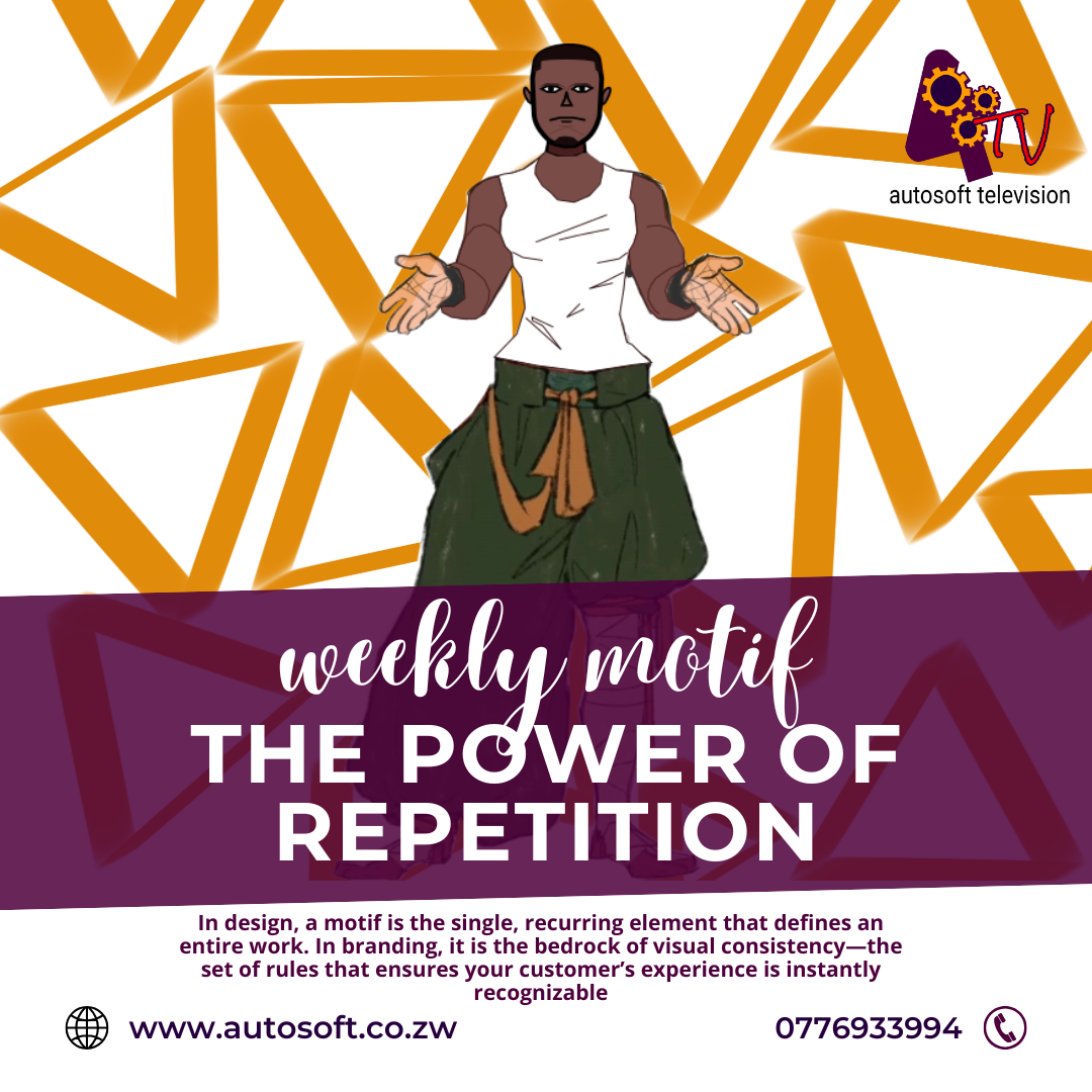
In design, a motif is the single, recurring element that defines an entire work. In branding, it is the bedrock of visual consistency—the set of rules that ensures your customer’s experience is instantly recognizable, whether they’re on your homepage or using your software tools.
Why Disunity is the Silent Brand Killer
A break in the visual motif is more than just an aesthetic blunder; it’s a break in trust.
When a user moves from your sleek, dark-mode website to a clunky, bright-white internal portal that looks ten years older, they subconsciously ask: Are these two things even related? Does this company value professionalism? If the presentation is inconsistent, the user assumes the underlying quality of the product or service is also inconsistent.
A strong digital motif closes this gap, ensuring that every interaction feels like a deliberate, professional extension of the core brand promise.
Three Elements to Define Your Digital Motif
To build a cohesive visual experience, focus on establishing and strictly enforcing rules for these three core elements:
1. The Dynamic Color Palette
Your motif starts with color. It’s not enough to list your brand’s primary red and secondary gray. You must define a dynamic color system—a set of rules for how color behaves in every state and context.
Action Color: What is the single, non-negotiable color used for all primary calls-to-action (CTAs)? (e.g., "Sign Up," "Confirm," "Send"). This color must be instantly recognizable and reserved exclusively for high-priority actions.
Status Colors: Define the system for feedback: green for success, red for error, yellow for warning. Even small notification dots must adhere to this motif to communicate information instantly.
2. Typographic Hierarchy and Voice
Typefaces carry enormous weight in defining a motif. If your marketing materials use a clean, modern sans-serif font, your software UI should not suddenly switch to a heavy, traditional serif.
Beyond the fonts themselves, the motif governs the hierarchy:
The "H1 Rule": Only one H1 per page, reserved for the absolute main heading.
The "Body Rule": A single, easy-to-read font size and weight for all body text to ensure maximum accessibility and scannability.
This extends to the written voice. Is your brand conversational and encouraging, or formal and authoritative? The motif applies to the tone of every error message and confirmation prompt.
3. The Interactive Pattern (UX Motif)
This is where software brands often falter. An interactive motif defines the standard user experience (UX). It answers questions like:
How does an element indicate it’s clickable? (Shadow, border change, color shift?)
Where does navigation always appear? (Top left for main, bottom for mobile.)
What is the standard shape of a button? (Always rounded? Always sharp corners?)
If the presentation is inconsistent, the user assumes the underlying quality of the product or service is also inconsistent.
By standardizing these interactive patterns—for example, making all loading states use the same spinning icon, or all confirmation modals look identical—you reduce cognitive load. The user doesn’t have to learn a new interface when moving from your app’s dashboard to its settings menu; they recognize the underlying motif and feel instantly at home.
The Autosoft Advantage
For a brand built on software, maintaining a consistent motif is not optional—it’s existential. Using powerful design systems and component libraries helps software teams enforce these rules automatically, ensuring that no new feature or platform is ever launched with an off-brand, fractured design.
When you invest in a singular, strong motif, you’re not just making things pretty; you’re building a reliable, cohesive experience that breeds user confidence and strengthens brand loyalty in every click.